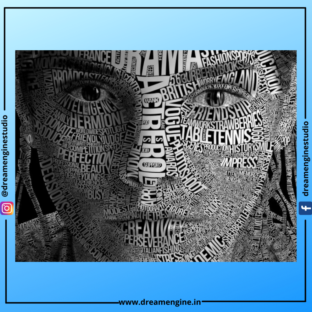
We’re constantly processing printed words, whether on our phones, in novels, or on websites. Type may be seen everywhere, from instruction books to storefronts. We typically examine the power of the printed language, but we rarely consider the role of the designer in mimicking the tone of the word or phrase.
Behind the scenes, a designer has thought about the relationship between the text’s appearance and what it says. Different emotions, surroundings, and emotions can all be represented simply by changing the typeface.
We’ll reveal everything you need to know about typography in this article. We’ll begin with a definition of typography, as well as a brief history of its development. The benefits of good typography and the influence it can have on your users will then be discussed. Finally, we’ll look at the many components of typography and what they all imply.
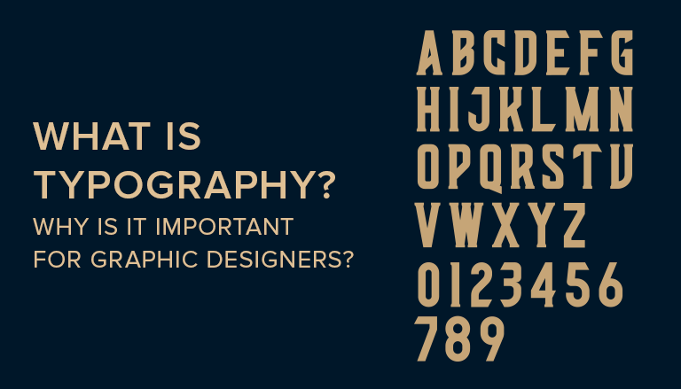
What is typography and how does it work?
Let’s start at the beginning: what exactly is typography? In its most basic form, typography is the skill of arranging letters and words in such a way that the copy is readable, clear, and visually striking to the reader. Typography is the study of font style, look, and structure with the goal of eliciting specific emotions and communicating specific messages. In a nutshell, typography is what makes a text come to life.
Typography dates from the 11th century, when movable type was first invented. Typography was a specialist craft linked with books and publications before the digital age, and later public works. The Gutenberg Bible, which sparked a typography revolution in the west, is the first example of typography. Fun fact: the typeface used for the Gutenberg Bible is now called Textura, and it can be found in the font drop-down menu of most modern desktop apps!
In today’s world, typography is largely related to both the paper and digital worlds. With the advent of the internet, the art of typography experienced a creative explosion. Web designers suddenly had access to a plethora of typefaces and type variations, making typography more visually diversified than ever before.
In graphic design, choosing and designing the appropriate type is crucial. Even if you don’t notice it, typography gives character and plays an emotive role in every design.
Typography may evoke a sensation, remind you of a certain brand, or create a mood. Consider the aggressiveness of the FedEx logo (complete with a hidden arrow!) or the classic black letter design of The New York Times’ header in terms of branding. Consider the layout of your favourite magazine when it comes to editorial typography. Consider how different fonts are utilized in different apps on your phone.
When typography is awful, though, it can be distracting and even unreadable. Consider the last time you were perplexed by sloppy type in an app, misled by ambiguous signage, or tried to comprehend an incomprehensible booklet or packed goods.
When you think about it, typography is the foundation of all communication, whether it’s logos, commercial content, magazine and newspaper headlines, even book chapter headers.
It’s especially crucial for designers to have a solid understanding of typography so they can explain why they made specific typographic decisions in their own work.
We teach the fundamentals of typography and typesetting at Shillington because it is a driving force throughout all forms of visual communication. Continue reading to learn more about the history of type, how to follow typography rules, and a glossary of typography words.

What is the significance of typography?
Typography is more than just picking out pretty fonts: it’s an important part of the user interface. Good typography will generate a strong visual hierarchy, give the website a graphic balance, and determine the overall tone of the offering. Your typography should direct and enlighten your users, improve readability and accessibility, and provide a positive user experience.
Let’s take a closer look at why typography is so crucial.
Brand awareness is aided by typography.
Not only will beautiful typography add flair to your website, but most users will subconsciously identify the typeface you pick with your brand. Unique, regular typeface will help you build a strong user base, build trust, and take your brand forward.
Typography has an impact on decision-making.
The way readers absorb and comprehend the information delivered by the text is greatly influenced by typography. Strong fonts that support the text’s meaning are far more persuasive than weak fonts that don’t.
Typography is used to keep the reader’s interest.
If you employ good typography, it could mean the difference between someone being on your website for a minute or half an hour. It’s crucial for your website to be visually appealing yet memorable, which is where typography comes in.
The history of typography
Designers try to combine historical concepts with modern thinking to produce aesthetically pleasing outcomes that must often operate in print as well as digital. Type was created by a type maker and a typesetter and dates back to the 11th century in East Asia (yep, Johannes Gutenberg did not invent the printing press). By the 1800s, the manufactured letters had been turned into metal blocks. Each typeface, its overall design, was transformed into fonts and sold to print shops.
The fonts would then be set by the typesetters at the print shops, who would often include space to allow the type to breathe and make it easier to read. Because the spacers they used were composed of lead, the process of adding space came to be known as leading. Leading and fonts are both measured in points such as 10, 12, 14, and typefaces can have different weights—bold, regular, or light—and combining the two is an art that, when done effectively, results in clear, even gorgeous communication.
Type makers now have the opportunity to create without the physical limits of the past, thanks to the digital age and easy access to lightning-fast computers. Fonts wouldn’t have to be depicted by metal blocks anymore, and leading isn’t actually lead. Despite this, the industry progressed slowly, sticking to tried-and-true fonts even when new ones appeared.
Although most designers no longer study the original vocabulary, fonts, or typographic rules, the shadow underlying form of these ideas may still be observed in typefaces that operate in print and online.
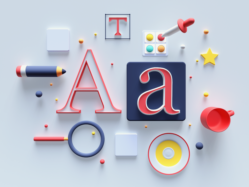
The various typographic elements
To begin learning typography, you must first master the eight key typographical design aspects.
Typefaces and Fonts
The distinction between typefaces and fonts is often misunderstood, with many people confusing the two. A typeface is a design style that includes a variety of characters in different sizes and weights, whereas a font is a graphical representation of a written character. Simply said, a typeface is a collection of linked typefaces, whereas fonts are the different weights, widths, and styles that make up a typeface.
Serif, sans-serif, and ornamental typefaces are the three most common types. A smart designer will never use over three typefaces—and ornamental fonts will be kept to a minimum—to keep the interface simple and streamlined. Many UI designers will mix serif and sans-serif typefaces, for example using a serif font for the main body text and a sans-serif font for the title, or vice versa.
Contrast
Contrast, like hierarchy, aids in conveying to your audience which concepts or messages you wish to stress. By focusing on contrast, you may make your content more intriguing, significant, and attention-getting. To add impact as well as break up the page, many designers experiment with different typefaces, colours, styles, and sizes.
Consistency
It’s crucial to keep your typefaces constant if you want to avoid a jumbled and disorganised interface. It’s critical to use the same font type while communicating information so that your readers can immediately understand what they’re reading and begin to see a trend. While it’s fine to experiment with different hierarchical levels to a certain extent, it’s best to stick to a consistent typeface hierarchy (a font for headings, another one for subheadings).
There’s a lot of empty space.
White space, often known as ‘negative space,’ is the area around text and graphics. White space is typically disregarded and goes unnoticed by users, yet it guarantees that the interface is tidy and the content is readable. White space can also help to bring attention to the content and provide a more pleasing entire experience. Margins, padding, and sections with no text or visuals are all examples of white space.
Alignment
Alignment is the act of constructing and unifying text, graphics, or images to guarantee that each piece has the same amount of space, size, and distance between them. Many UI designers use margins to make sure their logo, header, and body text are all in the same place. It’s a good idea to follow industry standards when harmonizing your user interface. For readers who read left to right, aligning your text to the right, for example, will seem odd.
Colour
One of the most interesting aspects of typography is colour. This is where designers can truly let their imaginations run wild and take the user interface to the next level. Text colour, on the other hand, should not be taken lightly: getting the font colour just right may make the text shine out and express the message’s tone —but doing it wrong might result in a jumbled interface and text that conflicts with the site’s colours.
Value, hue, and saturation are the three main components of colour. A smart designer will manage to balance these three elements so that the writing is both appealing to the eye and easily readable, especially for individuals with visual impairments. Designers will frequently test this by viewing the text in grayscale (without colour) and making adjustments if the text is excessively dark or light in comparison to the background colour.
Hierarchy
One of the most important aspects of typography is to establish hierarchy. The purpose of typographic hierarchy is to distinguish among notable pieces of content which should be noticed and read first, or regular text copy. Artists are asked to be succinct in an age of limited attention span brought on by social networks, and to produce typefaces that allow users to digest the essential information in a short period of time.
Sizing, colour, contrast, and alignment can all be used to create hierarchy. For example, if you’ve a line of copy with such a red exclamation point icon just at the start that is larger than the prior copy, the readers will know it’s a call to action. Size is the most common illustration of typographical hierarchy: heading should always be bigger than subheadings and regular text.
What factors should you consider while selecting a typeface for your website?
Let’s talk about the process of selecting typefaces for your interface now that we’ve familiarized ourselves with the various typography components. It’s easy to become overwhelmed when there are so many different fonts and typefaces to pick from. Making the best decision requires far more than just looking at what is attractive. Here are a few crucial points to keep in mind:
Consider your personality.
What do you want your visitors to think when they first visit your site? Do you wish to create a welcoming environment? Do you want your website to have a high-end, welcoming, playful, and serious vibe to it? It’s essential that the font matches the brand’s or product’s character. When faced with this difficulty, defining the essential characteristics of your brand and gathering typefaces that reflect these aspects is an excellent place to start. From there, you can start to see a pattern emerge.
Consider the tone of your voice.
It’s also crucial to think about how the typeface complements the message’s tone. Choose a less stylized or ornamental font that is both readily legible and will prevent distraction if you want to express serious or significant information, for example.
Don’t take shortcuts when it comes to functionality.
There’s nothing worse than a website that appears nice but is completely incomprehensible, causing you to click the incorrect button or turn in the wrong direction because the directions were unclear. Set aside style, aesthetic, and voice when determining which typefaces to use in your interface and consider whether the font is clear, readable, and inclusive. Is it possible to read the text without strain? Is there enough differentiation between the characters?
Take into account your performance.
Many designers ignore the importance of selecting typefaces that are compatible with web browsers. Web-based font files, such as those provided by Google Fonts, may be rendered flawlessly in a browser without any problems. When downloading online fonts, keep in mind that you should never download more character encodings than you require. You’ll avoid gaining weight this way!
Get motivated.
Take some time to look at what other people are doing when you’re not sure where to begin. Open your eyes to the typography you notice in your environment. Are there any patterns that you’ve noticed? Can you identify instances of good and terrible typography? Even browsing up fonts on Pinterest or following typography hashtags on social media will offer you some fantastic ideas of what’s out there. Further inspiration can be found in these eight typography trends.
Take some time to experiment.
What is the best method for determining the font to use for your interface? Always, always, always, always, always, always, always, always, always, always You’ll have a better understanding of what works, what doesn’t, what’s really legible, and what feels counterintuitive or clumsy by collecting relevant input from real users.
Short, to-the-point, and instructive
There are a lot of videos on the internet, and most people don’t want to spend a lot of time with just one producer. As a result, internet users choose to watch and participate in shorter videos.
I’m not trying to imply that longer videos aren’t useful in any way, but the idea is that you shouldn’t stretch the video out too far. A typographic video has a reputation for being concise and to-the-point (only top-notch videos). The usage of kinetic typography after impacts allows you to capture and hold the audience’s attention.
If you keep the video brief, a higher percentage of viewers will stay until the finish. When you employ kinetic typography animation approaches, you may quickly transfer information more efficiently in less time. When it comes to quickly delivering the key ideas, the mix of stylish motion texts and video is lethal.
According to the research, including video on a landing page can take several different forms by as much as 80%. You have a better chance of generating more clients and sales if you include a short kinetic typography video.
It’s ideal for emphasising key points.
Not every aspect of the videos is equally important. Some sections of the videos will solely discuss the topic’s background as well as other supplementary material. However, there really are parts of the videos Which are critical for viewers to grasp, and these points may work as triggers to get your potential consumers to take the action you want them to.
Depending on the nature of the video, a kinetic typography bold animation and kinetic typography plus shaped pictures may work well to explain and highlight key ideas.
Let’s say you’re trying to demonstrate the advantages of employing specific software using your movie. Using motion fonts to demonstrate crucial facts and then explaining the point’s nitty-gritty is a terrific approach to showcase important points. Users will have a better comprehension of what you’re attempting to express if you do this.
It’s entertaining to watch because of the aesthetics.
The entertainment component is one of the major reasons why a typographic video is so useful. Even if it contains useful information, people do not like to view a dull video on the internet.
The use of animated text movies can greatly boost engagement by making the film more appealing. The flow of the text, combined with the use of sound, attractive colours, and a little action, will keep your viewers watching the film.
The majority of the audience will watch the film until the conclusion if you know how to apply kinetic typography to its greatest potential. Some viewers might still re-watch the video just to marvel at the stunning animation.
Convert viewers into buyers.
Are you aware that your viewers can be watching your movies even without sound turned on? Yes, you read that correctly. According to a recent survey, 85 percent of Facebook users watched the video in silent mode.
It would make no sense in the case of a talking head video. The reality, however, is not the same as the kinetic typography video generator. You can send the message using no sound by using moving texts in the movie. Users were quick to read any subtitles in the video, so you don’t have to be concerned of whether or not it will function.
Retention and Attraction
All of the elements in the kinetic typography animation film are designed to amaze marketers as well as business owners. First and foremost, video content is excellent for marketing, whether it’s for generating leads, closing sales, or conveying important information.
A text-based video is less expensive to produce and distribute, but it is just as beneficial in increasing results.
When we blend stylish moving texts with audio to transfer information to our audience, the viewers are much more likely to absorb the video’s essential themes. If anybody misses your words, they can immediately get the concept by reading the typefaces in the film.
Adding some dynamic text to the beginning of the video is a terrific way to combine great music. You can effortlessly market your business name and capture the attention of the users. After then, using audio and text, it is feasible to more effectively convey the content by including several cues to increase their understanding level.
People who have a greater knowledge of the message you’re trying to express are more qualified than those who only have a rudimentary understanding of it.
To follow the rules of typography
It’s critical to master typography rules in order to grasp the fundamentals, as they will guide you as you enhance your design. Every designer should be aware of the following five essential principles of typographic design or any other sort of graphic design:
- A consistent structure is conveyed through the balance.
- Organization as well as direction are defined by a hierarchical structure.
- To enhance highlights, use contrast.
- Consistency as well as familiarity are achieved through repetition.
- Alignment in order to present a clean and well-structured image
Layout, white space, and colour are also important parts of typography fundamentals. It’s crucial to pay attention to the shapes formed by the words and letters. Encourage your mind to look above what a word “says” and instead focus on how it “looks.”
White space is a print and web design technique for making text appear less cluttered and more appealing to the eye. It’s critical to strike a comfortable equilibrium between the text and visuals and the blank background’s empty space, often known as white space. Furthermore, you can use white space to display hidden messages!
Color psychology is still being researched, but designers are aware that a combination of the visible spectrum’s basic hues (red, yellow, green, blue, and purple), as well as blends of these colours and “achromatic colours” (white, grey, and black) all have different effects when combined with text.
When it comes to typography in print, a large majority of the time, black font on a white background is used. According to studies, this is the easiest presentation to read. White letters on a black backdrop, on the other hand, are popular, especially in dramatic presentations, but they can be difficult to read in many circumstances, especially for persons with any form of vision impairment. Either white on black and black on white work nicely with larger graphics like interstate billboards as well as theatre screens.
Road signs are another example of real-world images that combine colour and type to convey fast and clearly while also representing basic typography conventions. Road signs exist in a variety of sizes, forms, and colours, but they’re always meticulously crafted to achieve a certain outcome. Yellow with black letters, for example, is a caution sign, whereas orange with black letters is a more serious warning sign. The bright backgrounds of these posts, especially for yellow-green school crossing signs, can be seen from a long distance.Signs using symbols, such as a one-way sign with just an arrow pointing inside the direction of traffic, are typically more effective than words in communicating with drivers. Visual representations are instantaneously understood, whereas text takes a few seconds to comprehend.
There is a lot more scope in web design, and colour plus type combinations of any and all kinds have been tried. When designing again for web, contrast is the most important factor to consider. To ensure readability, choose your colour palette, select a decent colour contrast analyzer, examine the body test contrast to ensure you can read this when it goes live, plus make sure controls & links show up properly. Having a style guide to refer to, just like in print, is usually beneficial.
To master typography, you must first study the rules before deciding whether or not to transgress them for creative reasons. Even if you’re new to graphic design and have never considered the print world or typography, knowing the fundamentals will provide you with a foundation for determining when to go beyond standard design constraints and when to stick to standard typography. The importance of testing in the whole design process cannot be overstated. The appearance of typography at the appropriate print or digital size may make and break a design.
So, whether you’re learning typographical design to become a professional designer or just to understand the science behind it, you should be aware that different typefaces express and associate with certain emotions. Take a look at the most well logos you’ve encountered. Many of them have the attributes of simplicity and relevance in common. The typeface used in a logo must complement the company’s image in order for it to be remembered and effective.
The most effective typeface design meets the expectations of the audience. Curvy colourful letters may be used in a fun amusement park, whilst a serious financial institution will most likely use a more classic font. All of the typographic elements covered here add to the emotions and sentiments associated with specific typefaces.
When it comes to typesetting, it’s important to remember the basics of typography.
Beyond the fundamentals, typesetting is an essential part of understanding typeface in graphic design but something that all professional graphic designers should be able to do. It’s the skill of making a large volume of text appealing and accessible to the target demographic.
‘Good typography should go undetected,’ as the adage goes—in other words, your audience should be able to enjoy reading your material without even being distracted by text that lacks rhythm, continuity, and a basic sense of readability.
Many considerations must be made when typesetting copy, including line length, size, leading, and font for headers, sub – headings, as well as body copy, as well as footnotes & buttons. Typesetting decisions could include the spacing between characters, commonly known as tracking, the height of characters, and other minor characteristics.
A more comprehensive list and explanation of typographic terminology can be found in the list of typography terms below. Baseline, which aligns the bottoms of letters in a single direction, x-height, which is the hypothetical line running between the tops of lower case characters, and cap height, which matches the tops of upper case letters, are all important features to master at first. The proportions for letters and ornamental components in respect to each other are defined by these three lines.
While type characteristics aid in the placement of letters on a grid, type categorization is primarily concerned with the style and shape of the characters and how they are used in display as well as headline fonts by the designer. The distinction between serif and sans serif is a great example of this. A serif is a minor addition to a letter, such as a slight bend at the stroke’s end. For example, consider the capital letter “I.” A serif is a thin perpendicular line that appears at both the shirts and pants of letters, as opposed to just a plain straight vertical line. “Sans serif” is a more contemporary aesthetic in which serifs have been removed from the letters, giving them a more basic appearance.
The grid system, whether visible or invisible, is used to line up characters so that they are generally consistent with each other in all sorts of typography design. Because the results can be mixed or uneven without an axis or reference line, keeping the type based on a grid gives it a more steady look.
There are several elements that influence how letters appear on a page for each line of text. Both margins as well as letter spacing have an impact on this look. In a typical newspaper or magazine story, justified margins imply that the text is ordered in such a way that it looks even on all sides of the page, resulting in a square-shaped block of text. These even margins are commonly used in business reports, which so many people identify as having a high-end professional look.
Except for desktop or other larger screen apps, one of the most important typography principles for text line length is to keep it between 40 and 55 characters. The eye does not read single words one at a time, contrary to popular belief, but rather scans the line, pausing briefly to examine groups of three or four letters. A line that is too long can fatigue the eye and make it difficult to detect the start of the next line. Lines that are overly short, on the other hand, cause sentence structure to be disrupted. It also necessitates eye changing lines too frequently.
Designers can’t go beyond this limit because of responsive web design, which keeps things simple to read. When text spans the entire screen, it may appear to be overly thorough. When there are fewer than 40 characters per line, it appears weak and narrow, giving the impression of “fluff content” when the intention was to convey an instructive blog or article.
Term definitions in typography
A thorough glossary of typographic vocabulary can be found below.
Our Shillington teaching staff suggests Typography Deconstructed’s fantastic Type Glossary if you want to learn more about type anatomy in depth.
Alignment: It refers to the process of aligning letters to a reference point, such as a margin.
Aperture: It is a white space at the end of a counter that is open.
Apex: The top point where two strokes are brought together is called the apex.
Arm: When one end of a horizontal stroke is not joined to a stem, it is called an arm.
Ascender: a lowercase letter’s stem that extends beyond the x-height.
Backslanted: The italics are slanted backwards.
Ball Terminal: a letter extension in the shape of a ball.
Baseline: The imaginary line on which a line of text sits is known as the baseline.
Bold: Bold is a hefty weight of any typeface that is frequently employed for emphasis.
Bowl: the basic body shape of uppercase letters such as C, G, and O, and lowercase letters such as b, c, e, o, and p.
Bracket: in some typefaces, a curving connection between the stem and serif. Serifs aren’t all bracketed serifs.
Calligraphy: The skill of writing letters with a highly specific tool is known as calligraphy (e.g., broad nib pen, brush pen, etc.)
Cap Height: Capital letter height is measured from the baseline to the top of the capital letter. It’s built around letters with flat tops and bottoms, like a H or an E. B, C, D, G, O, Q, and S are capital letters featuring curves that extend slightly around each cap height to appear visually similar in size to other letters.
Center aligned: When text is aligned to the centre of a text frame, a rag appears on the left and right sides of the text frame. When body content is positioned within a text frame, a rag appears on both sides of the text frame.
Characters: A letter, number, punctuation mark, or symbol is a character.
Character Set: For any given typeface weight, a character set is the whole array of characters.
Counter: The white area enclosed by a billion to $ 10 billion, whether completely contained, as in ‘d’ or ‘o,’ or semi – enclosed, as in ‘c’ and double ‘a.’
Crossbar: A stroke along a stem (as in the horizontal line of the letter ‘T,’ ‘H,’ ‘E,’ and so on) is known as a crossbar.
Descender: The stem of a subscript that extends below the baseline, such as the g, j, p, q, and y, is called a descender.
Ear: The stroke linked to the basin of the lowercase g is called the ear. Again for lowercase r, several typographers use the same name.
Ellipsis: Ellipsis is a three-pointed character.
Extended: A character with an exaggerated breadth, such as an emphasis mark, is called extended.
Grid: a layout of vertical and horizontal lines for alignment that can be imagined or real.
Descender: When a portion of a letter falls below the baseline, it is called a descender.
Display: Due to their hefty weight and/or intricate nature, display typefaces are usually employed for headlines and subheads.
Font Color: Font Color is a term used in web design to describe the colour of a font.
Font Size: The height of a typeface is measured in font size. From one baseline to the next, it is commonly measured in points (8, 10, 12, etc.).
Font Thickness: the thickness of the font (light, regular, medium, bold)
Hook: A curved arch (as seen on the letter ‘f’) is referred to as a hook.
Hand-lettering: It is the process of making handmade letters for a specific purpose or client from scratch.
Italics: Italics are slanted characters that were invented in the early 1500s.
A stroke connects to a stem at a joint.
Justified: When text is aligned to the left and right margins within a text frame, with no rag on either side, it is said to be justified.
Kerning: The gap between individual pairs of characters is known as kerning.
Leading: the horizontal gap measured from baseline to baseline between two lines of text. It’s also known as ‘line height’ in some circumstances.
Left-aligned: Text that is left-aligned is aligned with the left margin.
Leg: downward stroke with a short stroke.
Ligature: When two or more letters are connected together as one ch, this is called ligature.
Link: The stroke that connects the bowl and the lowercase g’s loop is called a link.
Lowercase: The alphabet’s non-capital letters are referred to as lowercase characters. They make up the majority of printed text, with uppercase and capital letters being employed largely to begin sentences or to identify proper names. Lowercase comes from the days of metal type, when the more often used characters were maintained in the lower case and the less frequently used capital letters were kept in the upper case, which was more difficult to access.
Monospaced: a typeface in which each character has the same width.
Orphan: A single word that appears at the start of a page is called an orphan.
Point size: The point size of a typeface is the distance between the top of the highest ascender and the bottom of the lowest descender. This was originally the height of the metal block on which each individual letter was cast.
Rag: A block of type with an irregular vertical edge is called a rag. It could be on the left, right, or both sides.
Readability: It is the ease with which a text can be read.
Right-aligned: When text is positioned to a right margin with a rag just on the left side of the text frame, it is said to be right-aligned.
Sans Serif: strokes on characters aren’t extended.
Serif: a stroke made across the arm, stem, or tail of a letter at an angle or obliquely. Some characters have it on their vertical and horizontal strokes. Serifs can also be classified as slab, hairline, or other types of serifs.
Shoulder: a curving stroke that is attached to a stem.
A letterform’s stem is a vertical stroke. Both lowercase and uppercase letters are available.
Stress: It is defined as a change in stroke width across a letter that is either diagonal or vertical.
Stroke: Any linear feature on a letter is referred to as a stroke.
Swash: a decorative stroke is added.
System Font: The main font used by a computer operating system is known as the system font.
Tracking: The amount of space between all characters across a line of text is called tracking. Letterspacing is another name for it.
Type Classification: Characters are classified according to their style.
Type Properties: Characters that fit on a grid have properties called type properties.
Typeface Design: The process of designing a whole set of characters in a given style is known as typeface design. This could include capital and lowercase letters, mathematical symbols, punctuation, and digits, among other things.
Type Size: The distance between the top of the highest ascender and the bottom of the lowest descender is known as type size. It’s commonly expressed as a number of points.
Typesetting: The process of putting out vast volumes of text (e.g., a book, a magazine, etc.) and ensuring that it is legible and readable is known as typesetting.
Uppercase: Uppercase letters are the alphabet’s capital letters. Uppercase letters are typically employed as the first letter of proper names and at the beginning of phrases. The term uppercase comes from the era of metal type, when the less frequently used capital letters were preserved in the upper case, while the more frequently employed letters were maintained in the lower case, which was closer to hand.
Vertex: The bottom point wherein two strokes are linked together is called the vertex.
Widow: a single word at the end of a paragraph or a sentence.
X-Height: The height of lowercase letters in any specific typeface is referred to as X-Height. The length of the letter ‘x’ is used to calculate the measurement. Curved lowercase letters typically extend slightly along each x-height to look optically comparable in size to certain other letters.
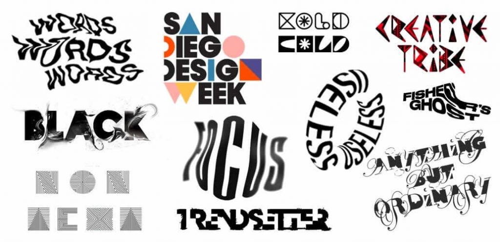
Why Should You Hire Our Animation Company?
The Dream Engine Animation Studio in Mumbai is a one-stop studio for Typography, 2D and 3D animation for the education, medical, engineering, architecture, and entertainment industries. Dream Engine Animation Studio, Mumbai offers a wide range of animation services to promote businesses for their ambitious services and products.
If you are looking for an animation studio to enter the smart world for 3D animation contact Dream Engine Animation Studio, Mumbai without wasting a minute.
You can also follow us and connect to us on Facebook/ Instagram/ Twitter/ LinkedIn
You can watch the work of Dream Engine Animation Studio, Mumbai on our YouTube channel.
- Fair pricing with no hidden charges and unrestricted humility to enhance your client service.
- Maintain your peace of mind with the most experienced vertically integrated team of enthusiastic storytellers and a highly efficient collaborative approach.
- We believe that art cannot be made, and that it should not be. As a result, we make sure that each film is hand-drawn and that you control all of the rights to it.
Closing
To be honest, I don’t see why anyone shouldn’t use typography templates, regardless of the type of business they run. The reasons listed above persuade me to spend time and money learning about and utilising the power of fantastic motion texts.

