Fonts play an important role in designing, in showcasing your brand value and ethics, be it your Marketing Brochures, Stationary, Corporate Communications, etc. Give your products/services a polished professional branded look, showcase your brand’s persona for using the right font.
Again, the internet is full of such premium designer and presentable fonts but why pay for it, when some considerate designers are providing fonts for free for commercial use.
In this article, Team Dream Engine Animation Studio, Mumbai have compiled a list of few free for commercial use fonts, to use in your next graphic designing project. The fonts have been divided based on different font family categories. You can download these fonts from their respective owner websites and if you like it, you can be considerate and donate them to keep them motivated and continue with the good deed they already have been doing.
1. Free Serif Fonts
If you want your branding to be towards the classy side, Serif Fonts should suffice your needs.
Unlike Sans Serif, Serif Fonts have a base at the start and end of alphabets, O and Q are exceptions. You check yourself in the free for commercial fonts list ahead
When we say Classy, it doesn’t have to be boring, hence we have listed down Dream Engine Animation Studio, Mumbai’s top 6 preference for Serif Fonts
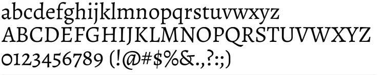
1.1 CHANTICLEER ROMAN FONT
Font uploaded by Nick’s Fonts. It is the second offering in his “Storybook Fonts” series, based on Golden Cockerel, designed by Eric Gill. This Free for Commercial Use can be downloaded from here. You can direct your questions and comments to himself@nicksfonts.com
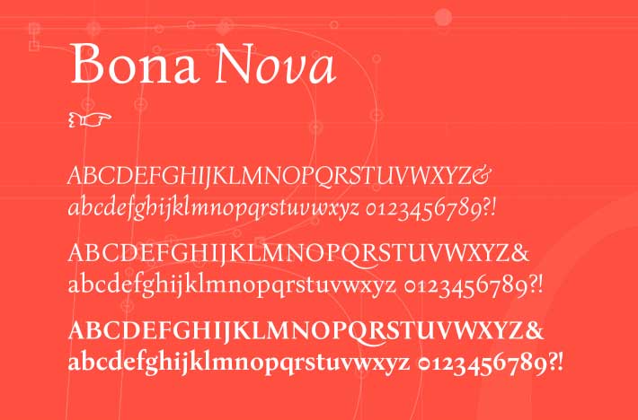
1.2 Bona Nova
The font has been uploaded by Mateusz Machalski, another graduate from Academy of Fine Arts. He and his team has created this font family in 3 classic triad forms, Regular, Italic and Bold.
This font is not just another free for commercial use font download, it has its reference to a font with a rich history. Bona Nova has been inspired by the Bona typeface designed in 1971 by Andrzej Heidrich. Andrezej has been well known as an extraordinary graphic artist and designer, with graduation from the Graphic Design Department of the Academy of Fine Arts in Warsaw. Bona Typeface is still used on most of the PolishcCurrency notes and the Military medals.
The font can be tried, tested and freely downloaded from here.
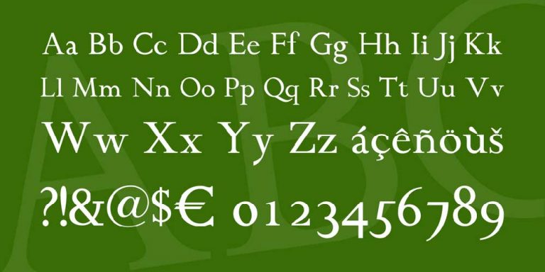
1.3 Alegreya
In September 2011 alegreya was chosen as the 53 “Fonts of decade” in “ATypl letter competition” and also one of the top 14 text type systems. It was additionally chosen in the second Bienal Iberoamericana de Diseño, a rivalry held in Madrid in 2010. It was developed by Juan pablo del peral for Huerta Tipográfica. It was originally intended for literature. Among its climatic features, it conveys a dynamic and varied rhythm which facilitates the reading of long text. Alegreya type system is “super family” which also includes “serif and sans serif sister families’ you can test it on fontsquirrel, simply click on “test drive ” tab.
1.4 Amethysta
Konstantin vinogradov designed this font with the motive of printing on low paper quality.This is the reason it has such moderate wedge serifs and terminals. It has simple and strong typefaces which makes it look elegant and decent. This font can be used for small to medium sizes, while some details are easily accessible with large sizes. In short Amethysta is a strong blocky logger of a typeface fit to be utilized on inferior quality paper. This font is available for free in commercial use. Test here.
1.5 Didonesque
Didonesque is designed by Paulo Goode. This ingenious and elegantly stylish font family was inspired by classic Didone typefaces. It’s ideal to utilize it for headlines, logotype, branding and short runs of text. Counting both little covers and unimposing covers with full European diacritics, you can blend and match these dainty covers with ordinary lowercase glyphs to make fascinating unicase-style typography. Some of its striking features include:higher x-stature, more limited ascenders and descenders, slight bends inside the x/y/w character, 4 loads in roman and italic style, banner and show styles in roman and italic, 4 loads in dense style, Small Caps, Petite Caps, Alternates, Ligatures and Contextual Alternates, full European character set, 750 glyphs for every textual style.You can try this versatile font here.
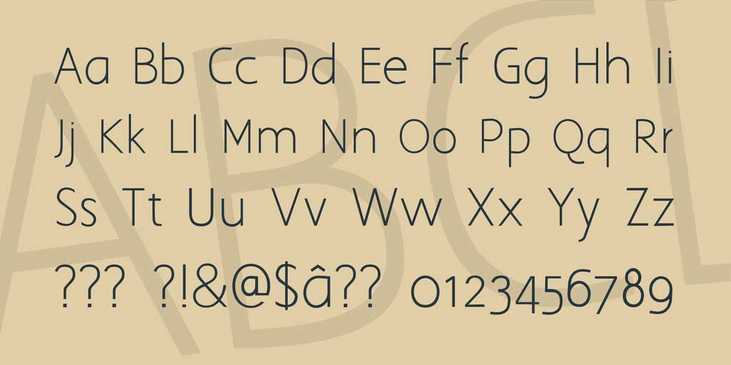
2. Free Sans Serif Fonts
Typefaces of this font are more modern than serif. It dearths strokes which makes it distinguishable from serif fonts. Sans serif typefaces are often used to signify something clean, minimal, friendly, or modern. These textual styles are frequently utilized on the web for huge gatherings of text in light of the lower DPI (specks per inch). They are easily accessible to children because of their simplicity. Listed below are the top 4 sans serif fonts:
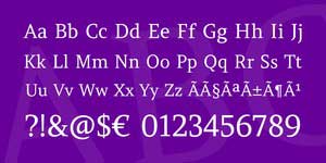
2.1 MODERN SANS
This sans serif font was designed by fortress tech. Just like Dream Engine Animation Studio, Mumbai has a YouTube Channel, this designer has also started with his YouTube channel. This font was downloaded for more than 100k times, amazing isn’t it?. He says this piece of art was inspired by fontark. You can try and download this font from here.
Wait there’s more to this designer, he has also created one more ingenious font as “Loving Memories Font”.
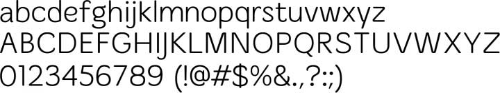
2.2 Primer print
Raymond Larabie was inspired by teaching materials for printing to construct this font. In OpenType wise applications, you can utilize the “expressive substitutes” highlight to get to a serifed J and a q with a sharp snare. Although it is licenced but it’s free for commercial use, you can install the fonts on a computer and use them to create posters, web graphics, game graphics, t-shirts, videos, signs, logos and more. Read the license agreement for details. You can also check more of his work here.
2.3 Aaargh normal
This classic font is designed by tup wanders. Tup wanders has been a font designer since 2000. Designer says “I needed a thin font like Avant Garde to use on packages, but a bit more stylish and modern. I couldn’t find one, so I made this”.
His line clarifies the utilization of textual style it is made for. You can try this font on 1001fonts.
2.4 Merge
This soft font is by philatype. It’s useful for casual use in light of its delicate surface. It is available in 4 weights and is also readable in small sizes. You can check more of his fonts here and test it here. Have a look at its usage terms before going for this amazing font.
3. free Graphic Fonts
Want to give your text a quirky and fancy look? Go for graphic fonts. These Realistic text styles will not work for each sort of plan, however when they tackle a job, they’re a shoe in. For example It tends to be utilized if your image is all rock-and-roll? Search for a tense realistic text style (like Eddie Regular, which you’ll see underneath) that shows your edgier side. Dispatching another mechanical technology application? A science fiction propelled text style (like Phantomonia) would be an extraordinary choice. Given below are the 2 best examples of the same:
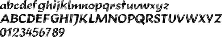
3.1 Brushstroke plain
Brushstroke plain is designed by kevin wills. It uses 256 Glyphs per font. It has clear brush strokes which makes it look artistic. You can use this font for various art purposes and posters to give it an artistic look. It can be tested here.
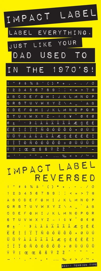
3.2 impact label
This unique font is designed by Tension type, Tension Type is the foundry of designer Michael Tension.This font was released in 2008 Which is also available for personal use along with commercial use. It gives all upper and lower case letters alongside some unique characters. Demo is available here.
4. Free Script Fonts
These areelegant or edgy, bold or delicate. It is said to be the most versatile font category in the design world. While picking a script font style, consider what generally looks and feel you need to catch in your plan and afterward pick a text style that makes that look and feel. For example, If you are going for rich and ageless? Pick a more fragile text style with exemplary embellishments (like adjusted components or a transcribed, cursive look). Going for a sleeker look? Search for something bolder and more present day.
4.1 Rhesmansia
It is a handwriting font designed by Jamaludin Ahmad Sahestya Dharma. It is elegant, natural, stylish and perfect for any awesome projects that need handwriting taste. You can utilize this for some reasons, for example, for photography, watermark, online media posts, notices, logos and marking, greeting, item plans, name, writing material, wedding plans, item bundling, unique occasions or anything that requirements penmanship taste.
It’s not over yet, There is yet one more style and we think that it’s amazing. This breathtaking font doesn’t belong to any font family but it’s marvelous and guess what? It’s likewise free for commercial use, yes you read it right. We have referenced beneath:
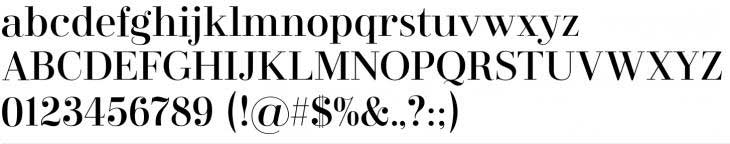
5.1 Wordan
Wordan is a Free for Commercial Use, created by Muskal Creative, a Graphic Designer from Indonesia established in March 2019. The font was launched on 23rd January 2021, according to the team “Wordan is a modern and incredibly distinct serif font. It celebrates abstract shapes in all their eclectic beauty.The hard lines with subtle rounded edges gives it a perfect mix of contemporary typography and classic design. Add it to your favorite design ideas and notice how it makes them come alive!” The font can be downloaded from here. At the download website you can even try the font before download. The Muskal team can be contacted at muksalmina081@gmail.com for any issues, feedback or licensing permissions.
Closing Statement
Even we as a professional Animation Studio in Mumbai, use such free for commercial use fonts, which means you do not need to pay the designers additional for fonts.
Quick Tip: Using only a freely available font can be too common but you can combine a few vectors and fonts to get an ultimate logo, making it unique and outstanding.
Additionally you can showcase some element of your business in your logo so that the viewer gets an overview of what your business does, for example; if we put Dream Engine Studio somewhere, our viewer wouldnt understand our business but writing, Dream Engine Animation Studio, Mumbai gives a clearer picture that Dream Engine is an an Animation Studio, located in Mumbai. Check our full blog, to discover more free stuff that can help you create new creative designs.
Similarly get a logo that resembles your business, created by your very own Dream Engine Animation Studio, Mumbai. Check Our Services page.
Is logo animation really significant for your company’s impression? There’s no doubt when presenting a company its logo is its first impression. Logo reveals also…